
Development
How I rebuilt a bespoke furniture website
A furniture website needs to explain what can be made, what the price includes and how to order it. Here’s how I rebuilt one around those questions.
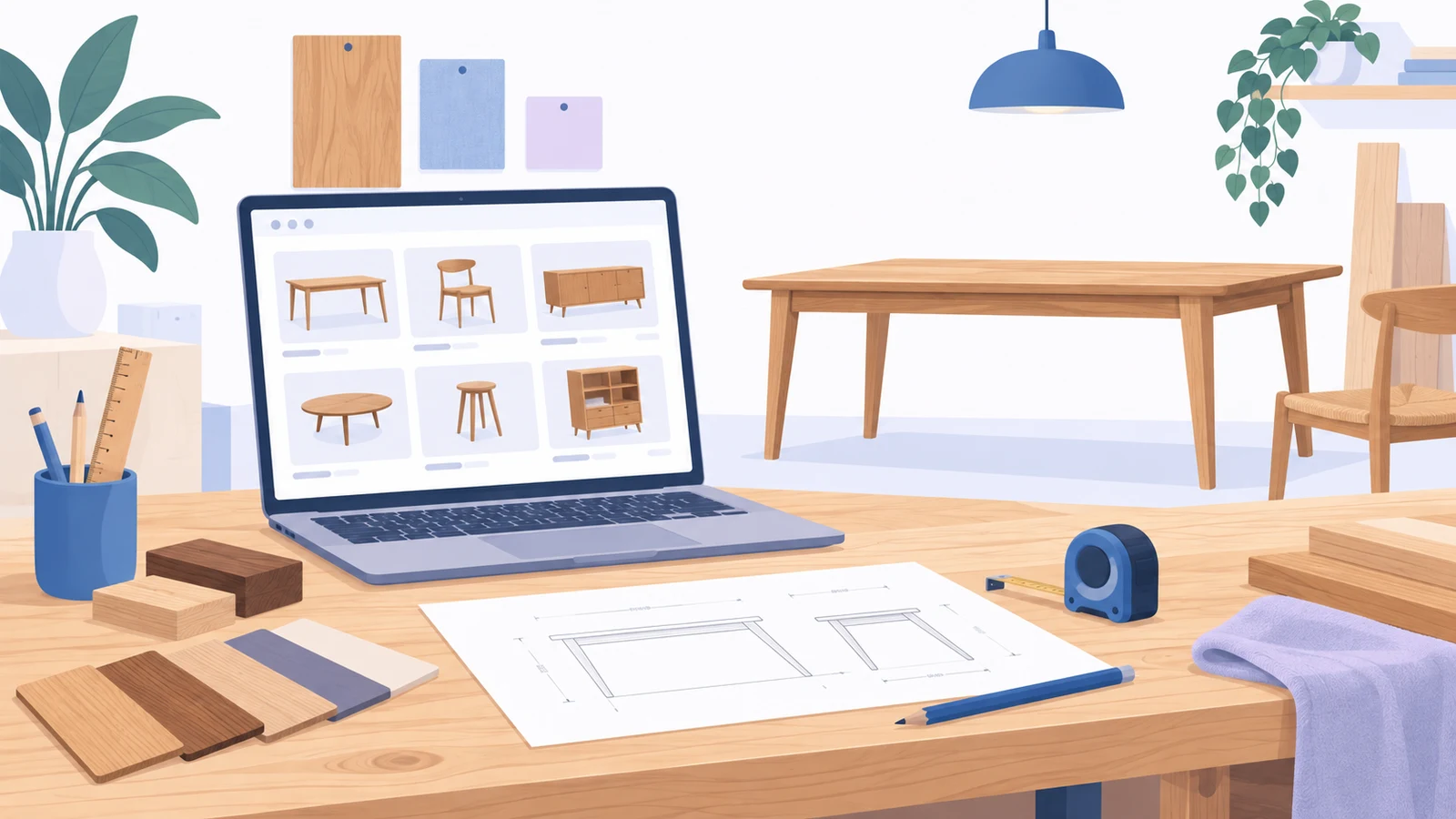
A table can look right in a photograph and still leave a buyer with several questions. Will it fit the room? Can it be made longer? Is the price for the table shown, or for a smaller version? Those questions shaped my rebuild of a solid-wood furniture website.
The project involved moving a long-established catalogue from MODX to WordPress and WooCommerce. It covered smooth and distressed furniture, standard reference models and custom work for homes and commercial interiors. The difficult part was making all of that understandable: turning years of product records, photographs and workshop knowledge into a website that helps someone choose a piece and ask for a useful quote.
Start with the way the furniture is sold
I chose to build the store around enquiries. A reference model gives the customer somewhere to start, but the final order may depend on dimensions, wood, finish, quantity and delivery. Asking someone to pay before those details are settled would skip an important part of the sale.
WooCommerce still made sense. It provides a catalogue, reusable attributes and variations; the primary action can be “Ask about this model” or “Request a different size”. A buyer furnishing a whole room also needs a shortlist, so several pieces can be discussed together.
That decision changed what I looked for in competitor research. I followed the buying journey from category to product to enquiry, looking for dimensions, prices, finish samples, completed projects and an explanation of the order process. A large catalogue was interesting only if a customer could make sense of it. The more useful comparison was how much a visitor could learn before having to call.
The research also exposed a mistake in my first keyword collection: I had allowed the scope to spread beyond what the workshop could usefully offer. I withdrew that version and checked the replacement shortlist against the actual assortment. A phrase can be relevant to furniture and still be a poor reason to build a page for this business.
I used product type as the main structure, then considered material, shape, room and intended use. For example, “round dining tables” may deserve a selection page if the catalogue has suitable models and the search intent is distinct. A restaurant furniture page has a different job: help someone choose compatible pieces, understand customisation and describe a larger order.
Make the old catalogue usable before importing it
The legacy site held more information than its visible pages suggested. There were unpublished records, custom fields, gallery sequences and price tables inside product descriptions. I took a database snapshot and file archive first, then built a local SQLite inventory from the source tables.
I kept the original values alongside the cleaned fields and retained a stable legacy ID for every record. That made it possible to trace a new product back to its source, check a suspicious price or recover a missing photograph without repeating the whole migration.
Each old record needed a destination. Some became products, some became variations of another model, and others remained drafts or were retired after review. Comparing the total number of cards on the two sites would have missed these distinctions. A parent product with several finishes can replace several old cards without losing the choices they contained.
Cleaning the data involved decisions that a simple import cannot make. “Pine; oak available on request” describes a reference material and a custom option. Putting both values into the same wood-species field would make the filters misleading. A steel frame belongs under construction, while a stain colour belongs under finish.
I standardised names, units and punctuation in the data itself so the same values could be used in filters, specifications and product copy. Where a description left something unclear, I kept a question for the workshop. That is particularly useful for hardware, dimensions and construction details that a photograph cannot settle.
AI-assisted classification helped sort descriptions and flag possible attributes for review. It was useful for finding likely shapes or inconsistent terminology. Exact dimensions, wood species and hidden fittings still needed a written source or confirmation from the maker. Otherwise, an attractive product page would simply make a guess look authoritative.
Treat photographs as product data
I separated original photographs from the many thumbnail sizes produced by the old site, checked duplicate files and preserved gallery order. That order matters: a full view introduces the piece, while close-ups can explain joints, handles, texture and finish.
WebP copies reduce the weight of a gallery while the originals remain available. Image editing needs the same care as copy editing. Changing a handle, joint or proportion changes what the customer thinks they are ordering. Where a photograph was too small or did not clearly show the product, the useful next step was to request better photography.
Give people several ways into one catalogue
A customer looking for a table, a customer furnishing a dining room and a customer planning a restaurant may all need some of the same products. I built those routes into the navigation while keeping one product record for each model.
Product categories form the backbone. Room and business pages bring together suitable models, relevant projects and practical advice. Material and shape pages help narrow the choice where the underlying data supports them. This lets the site answer different buying questions without maintaining several copies of the same furniture.
I also separated a product’s address from its position in the category tree. Products have a stable URL beneath the catalogue prefix; navigation and breadcrumbs explain where they belong. If a model moves into a better category later, its address can stay the same.
Decide which filters deserve a search page
Filters depend on consistent data. If one product says “solid oak”, another says “oak wood” and a third mentions oak only in its description, a wood filter will be unreliable. Reusable attributes gave me a common vocabulary for the catalogue.
A filter selection and a search landing page serve related but different purposes. Customers should be able to combine options freely while browsing. A permanent landing page needs a useful selection, a clear purpose and content that helps someone choose. I kept an explicit register of approved pages instead of allowing every possible combination to create another indexable URL.
| Customer’s starting point | Useful destination |
|---|---|
| “I need a dining table.” | A product category with relevant filters and clear model cards. |
| “I need a round table in oak.” | A filtered selection, or a reviewed landing page if the assortment and demand support it. |
| “I’m furnishing a restaurant.” | A curated page with suitable products, completed work and a route to discuss quantity and specifications. |
| “Which finish should I choose?” | A material or finish guide linked to real samples and the relevant models. |
The crawling rules need to reflect that distinction. Sorting and filter combinations can multiply rapidly, which is why Google’s guidance on faceted navigation is useful during planning. I treated approved landing pages separately from ordinary browsing states, then reviewed canonical URLs, pagination and indexing rules for each.
Make the product page worth reading
The first screen had a simple job: show the model, explain the price, give the main specifications and make the next step obvious. The rest of the page could then answer the questions that arise when someone starts imagining the piece in their own room.
Price labels needed particular care. A “from” price is useful when it names the size and specification it covers. A custom piece may need a quote. A missing price should become a clear quotation state, not a zero that happens to pass through an import.
Dimensions also needed proper labels. The outside dimensions of a bed and its mattress size are two different things. Cabinet width, depth and height should remain distinct. For items sold by length, the unit belongs beside the price. These details are easy to lose when every old field is flattened into a description.
| What the buyer needs to know | What belongs on the page |
|---|---|
| What is included in this price? | The reference size, material, finish and pricing unit, or a clear request for a quote. |
| Will it fit? | Labelled dimensions, with separate internal or mattress measurements where relevant. |
| Can it be changed? | Confirmed custom options and a way to send the preferred dimensions. |
| What will the finish look like? | Real samples, close-up photographs and a reminder that screens affect colour. |
| What happens after I enquire? | How specifications are agreed, followed by the applicable payment, manufacturing and delivery steps. |
| Can I see something similar? | Relevant completed projects and related models. |
I kept the old price tables separate from descriptive copy. That allowed the wording around a product to improve without accidentally removing a rate or changing its meaning. It also gave pricing information a defined place to be checked when the catalogue was updated.
The description then had room to do useful work: explain the visible construction, how the model differs from nearby alternatives and which choices need a conversation with the workshop. Adding more words was less important than answering the next reasonable question.
Show the work, then make it easy to ask
For a furniture maker, the portfolio belongs close to the catalogue. A completed dining room can show how a table, chairs and finish work together. It can also lead back to the models involved. Conversely, a product page can point to a project where a customer can see the piece in context.
I developed workshop, team, showroom and review sections around the same principle: give the buyer something specific to judge. Production photographs show how the furniture is made. Staff profiles explain who handles design, manufacture or enquiries. A project description can set out the brief, the materials and the work shown.
These sections work best when the detail comes from the business. A short account of a known project is more useful than a polished story built around an unexplained gallery. The same applies to reviews: show the source of an excerpt and make clear whether the customer is reviewing the company or a particular product.
Material guides and a glossary can answer questions that would otherwise interrupt the sale. A finish guide belongs beside the finish choices; a care article belongs beside the products it applies to. I planned those links as part of the catalogue, so the advice is available at the point where someone needs it.
Carry the customer’s choices into the enquiry
I built three main ways to enquire: ask about one model, send a shortlist, or describe a custom project. Each starts with the information the customer already has. Someone on a product page should not have to copy its name into a blank contact form.
A custom brief asks about the piece, approximate dimensions, material, quantity and intended setting before collecting contact details. The fields should help someone explain the job. A person who does not yet know the right wood or exact measurements still needs a way to start the conversation.
On mobile, I worked through the whole sequence: open a category, apply a filter, view a gallery, save a model and send an enquiry. Selected filters need to remain visible. Closing a panel should return the customer to a sensible place. A sticky enquiry button needs room around it so it does not cover the last specification or a form error.
I tested direct visits to product and category URLs as well as clicks through the menu. The form should carry the selected model, variation and quantity into the saved enquiry. A success message only tells the customer that something happened; the workshop needs the right details to answer.
Delivery, payment, lead times and care information belong along this route too. Buyers should be able to find the applicable terms while considering the product, rather than discover them after composing a long enquiry.
Plan the move while building the replacement
The catalogue work also produced the basis for the redirect map. Because each new record retained its old identifier, I could connect old product addresses to their intended replacements and review the exceptions: merged models, retired records and changed categories.
I combined the database inventory with the old sitemap, crawl data and webmaster records. The destination needs to match what the visitor expected to find. A merged product can point to its replacement; an unrelated homepage is a poor destination for a discontinued model. Google’s site-move guide covers URL mapping and the checks around a move.
Internal links should point straight to the new addresses. I also included images in the migration plan: a product can survive an import while losing half its gallery. Redirect tests need to check the final response, including HTTP and HTTPS, host variants and old path patterns.
Make the SEO output consistent
I gave the theme responsibility for the structured-data graph and used the SEO plugin for the chosen metadata fields. That made it easier to avoid conflicting product or organisation descriptions from different parts of the stack.
The same product facts must agree across the visible page, metadata and structured data. A quote-only model should not acquire a zero-price offer. Company reviews should not be copied onto every product as its rating. I checked the implementation against Google’s Product structured-data documentation, alongside the actual page content.
For the release itself, I use a short sequence with an explicit rollback point. It keeps the move manageable when the new catalogue, server configuration and enquiry handling all need to work together.
Account for old records, confirm prices and units, check galleries and finish the URL map.
Open representative URLs directly, try the desktop and mobile controls, and verify the details saved by test enquiries.
Take a fresh backup, enable redirects, set the live indexing rules, and check canonicals, sitemap URLs and form delivery.
Watch errors and indexing, then check whether enquiries reach the business with enough information for a reply.
Measurement should follow the same care as the migration. I reviewed the old site’s analytics to establish a baseline and separated phone clicks, form submissions and qualified enquiries. A click on a phone number is useful to track, but it does not tell you whether a conversation took place.
After a move, I would compare landing-page types, devices and query groups as well as total traffic. For this kind of business, the next questions are practical: can the workshop understand the brief, prepare a quote and respond promptly? Tracking that handover helps identify whether the next improvement belongs on the website or in the ordering process.
Common questions
Check it with SpiderHead
Free and local: run the audit on your own machine.